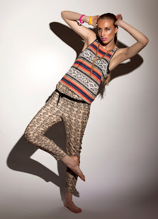
Stephanie did all the editing, we all decided as a group, even through looking at the photographers that were mentioned in the interim crit, that we quite liked the editorial and our final images, we just needed a few cropping and a small changes. We decided that looking back through our work, that it didn't portray robotics very strongly, and we would slightly change our narrative. We decided that our narrative showedd more of the creativeness you have as a child, and as you grow up and older through education you loose it. We have a colourful patterned clothing at the beginning of our sequence, leading to the more duller, darker outfits. We also have a prop-clock which shows how when you are older everything seems to be done to a time scale, compared to when you are a young child you have no perception of this. This thought this narrative worked alot better for our editorial and decided to run with this.
We came up with a few different ideas for a title such as; tick tock, growing up, losing creatvity. But i suggested we needed something that had the work creative/creativness/creativity into as it would portray our narravtive more. The ideas that then came about were; be creative and fashionable, fashionable creations. Sophie used the word manifestation, everyone liked this idea so we decided on The Creative Manifestation for our title.
These are the final 8 images for an editorial, in order.
This time as a group we have worked alot better, there has been alot more communication and i feel we are all happy with the final edited images this time. We have picked out the best ones and as a sequence they fit together really well. The lighting has worked well in the sequence, and the last image is the more intense compared to the first. (childhood-growing education-to adulthood). I feel the poses, expressions and the positions of the model for each image work well together as double page spreads and look quite professional. I feel the images were made a lot stronger once cropped, as when the girls took them they had quite abit or white space along the top, but to even them out and frame it betterwe cropped it off and made the images closer and intense.


No comments:
Post a Comment