Friday 29 April 2011

Final Layout

This is the final layout with the final 8 images edited. I am really happy with the images, i think they work really well together to make the editorial. I think it is professional looking, and something you would see in a high end fashion magazine. The editorial doesn't immediately say 'education' but that was the idea we wanted. I think everyone is really happy this time, and i think we worked alot better together as a group than the first time as we learnt from our mistakes of not communicating enough.


Contact sheets

These are the contact sheets from the shoot showing every photo the photographs took.


Layout ideas

While Stephanie was doing the editing we decided as a group we wanted to try out a few different layout ideas, for example a landscpae image over one page, or DPS and adding more than more image to a page. We decided we could only do this once the final images are edited, so we could what they looked like together and then play around and make changes to the layout. Stephanie emailed over the different layouts she had tried with all the inspiration from magazines we had discussed as a  group and on the meeting i had with her to look through the images.

Below are the different layouts and font styles are tried for our editorial.

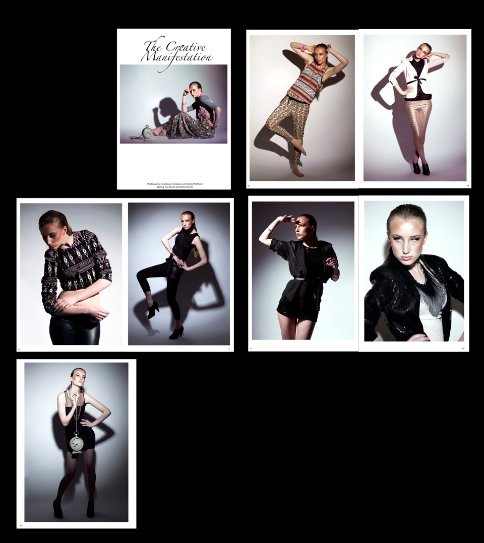
 This is my favourite layout style, I didn't feel the images were strong enough to make a DPS, therefore we needed each outfit to make up the 8 page editorial.The first image that was chosen was landscape, but i think having that contrast at the beginning works well. The image as i said wasn't strong enough i don't think to have as a DPS, i think Stephanie, Nikita and Sophie agreed once the editorial was put together.


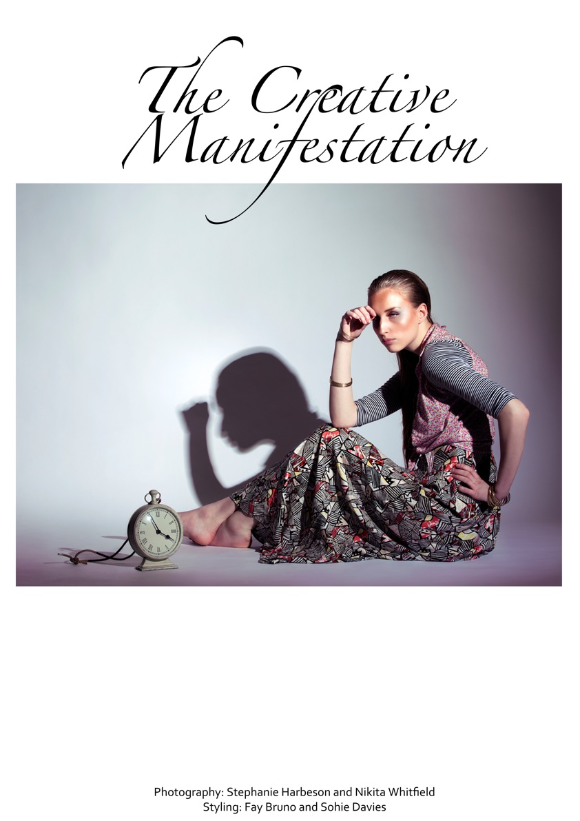
 This was the first mock up for the title page. I think the white background is a nice contrast as the images are quite intense. Its nice and simple with just are name credits at the bottom. we also quite liked this font, its more creative than a simple than Times New Roman.


 This was the other layout Stephanie tried. Stephanie and Nikita wanted to get rid of outfit 4, but because we had styled it so the middle outfits (outfit 4) had some pattern and plain garments, which would lead us through the transition to plainer garments they couldn't really take it out the sequence. It wouldn't make sense as an editorial, styling wise to do that. Outfit 4 is probably the weakest image, and we stuggled to find out that everyone liked, but i said it wouldn't make sense in the styling to take it out.


This is the final layout we decided on as a group. We wanted the images to have a small border around them, it looks professional and because the images are quite intense it breaks them down and make you stop to look at them as they don't bleed out to the edges. The white border against the intense soptlight lighting i think works well on the eye aswell. Some of the borders towards the end become larger, i think this is because Stephanie didn't size them onto an A3 page before she cropped them and made the borders. It would be good to have them all the same size, but it does work well with our theme, its as if the person is becoming smaller and idea of losing their creativeness through education has become greater than them.

Sunday 24 April 2011

Final 8 images, edited

Stephanie did all the editing, we all decided as a group, even through looking at the photographers that were mentioned in the interim crit, that we quite liked the editorial and our final images, we just needed a few cropping and a small changes. We decided that looking back through our work, that it didn't portray robotics very strongly, and we would slightly change our narrative. We decided that our narrative showedd more of the creativeness you have as a child, and as you grow up and older through education you loose it. We have a colourful patterned clothing at the beginning of our sequence, leading to the more duller, darker outfits. We also have a prop-clock which shows how when you are older everything seems to be done to a time scale, compared to when you are a young child you have no perception of this. This thought this narrative worked alot better for our editorial and decided to run with this.

We came up with a few different ideas for a title such as; tick tock, growing up, losing creatvity. But i suggested we needed something that had the work creative/creativness/creativity into as it would portray our narravtive more. The ideas that then came about were; be creative and fashionable, fashionable creations. Sophie used the word manifestation, everyone liked this idea so we decided on The Creative Manifestation for our title.

These are the final 8 images for an editorial, in order.


This time as a group we have worked alot better, there has been alot more communication and i feel we are all happy with the final edited images this time. We have picked out the best ones and as a sequence they fit together really well. The lighting has worked well in the sequence, and the last image is the more intense compared to the first. (childhood-growing education-to adulthood).  I feel the poses, expressions and the positions of the model for each image work well together as double page spreads and look quite professional. I feel the images were made a lot stronger once cropped, as when the girls took them they had quite abit or white space along the top, but to even them out and frame it betterwe cropped it off and made the images closer and intense.

Editorials with borders


I have also been looking through different high end fashion magazines that have editorials that include a white border, or some form of border around the images. I feel in some cases a border can work really well, it can make the images a lot stronger and add about of depth to the editorial. If the images are quite intense, sometimes i feel havig a white border can make them easier on the eye and make th viewer stop and look at the page in hand.

These are some editorials i have found with borders that i feel can help us decide whether we want a border or not.

GRAVURE MAGAZINE EDITORIAL / STOCKHOLM SYNDROME SHOT BY EMMA JONSSON DYSELL Fashion Tekla Knaust (New Blood Agency) / Make Up Ignacio Alonso / Agent Bauer / Hair Ali Perzadeh (Linkdetails) / Model Emilia N (Stockholmsgruppen)


This editorial has white borders around single pages and alo shows pages are DPS. Also it has the shadow effect that we have used on ssome of our images, i think this editorial will help us to decide whether we think our images will look better and stronger with or without one. I feel some of our images aren't  very strong, so a white border might help to bring them out on the page, it also looks porfessional and leaves a nice area for page numbers and credits.

Editorials without borders

One of the options we had to decide between was whether we wanted a border or not around our images. I have been looking through different issues of magazines like LOVE, I-D, POP and Vogue for editorials without borders so we could compare them and see if it would make our images stronger to have one or not.

Taken from Pop magazine.


Taken from Love magazine - Spring/summer 2011 issue.

Date: 02 FEB 09
Magazine: Plaza Kvinna - Sweden
Brand: United Colors of Benetton, Viscose dress with floral print
Photo by R. Sund
Styling by R. Andersson


Selena Gomez for OK magazine 2009.

All these iamges taken from different editorials in different magazines are strong enough or close-ups of a celebrity so that they dont need a border and can bleed to the edge of the magazine.

Genlux Magazine - Spring issue
Photography - Melissa Rodwell
Styling  - Kelvin Seah
Taken from fashionphotographyblog.com created by one.


These images for so strong in black and white, they just wouldn't look right with a border, espeically as they have a black background. They are all meant to be about the jewellery and close-ups of how to wear it. The theme was going travelling and different chunky jewels from different cultures and themes made up the narrative. These are examples of editorials i have found that show that havng no bordersaround your images can also work well.